If you are preparing to present data to an audience, you may be thinking about the most compelling, appealing ways to depict that data. One approach that is almost guaranteed to get and keep your audience engaged with your presentation is data visualization.
Whether you are presenting sales figures, market trends, or population statistics, there are visualization techniques you can apply to just about any data set to ensure your audience receives the right information while staying engaged and interested in what you have to present.
Regardless of your audience, these tried and true techniques will allow you to convey information accurately while visually appealing to just about any individual or group. Read on to learn more about data visualization and the tips you can apply to be successful.
What is Data Visualization?
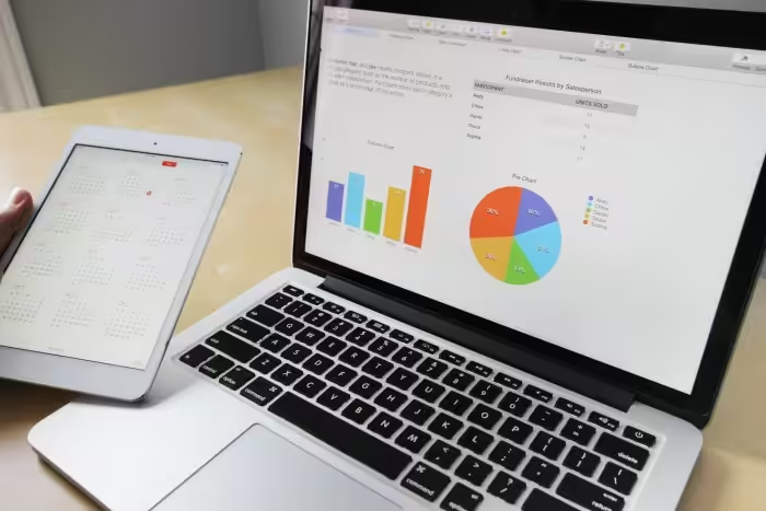
Data visualization is any presentation of data, including figures, statistics, rates, and trends, that uses images to convey information. Data visualization can include charts, graphs, diagrams, pictures, maps, and infographics. Data visuals are usually colorful and appealing, with clear labels and coherence between the data and the selected image.
You can think of data visualization as a kind of graphic storytelling. Rather than just words or numbers on a page, visual representations tell a story about the data giving listeners a mental image to combine with the knowledge they’ve gained.
Why Represent Data Visually?
People present data visually for many reasons. One reason is to get and keep an audience engaged. If you’re depicting numbers on a slide or in a report, people can get bored and disinterested in what you have to say. With visuals, on the other hand, you can hold your audience’s attention without them getting lost in a sea of numbers.
Another reason people present data visually is that visualization can make data easier to interpret and digest. We are naturally inclined to notice and identify patterns, trends, and changes. With a sizable data set, it can be hard to identify those things at a glance.
With data visuals, however, our eyes are quickly drawn to the patterns and outliers we see, making the meaning and conclusions behind that data easier to decipher. This is especially true of large data sets where it becomes increasingly difficult to identify the most important findings to take away.
Finally, people present data visually because it is more likely to compel action. For example, simply displaying numbers on the prevalence of an illness may not get an audience to do anything about it. However, presenting that data as an epidemiological map or visually representing the statistics with images of actual people does much more to appeal to someone’s sense of caring and convince them to do something.
What is Qlik Sense Extension?

Now that we’ve discussed the what and why of data visualization, it is time to consider how to visualize data in the best ways. If you’ve explored data visualization techniques, you’ve likely heard of Qlik Sense. What you may be less familiar with is the Qlik Sense extension.
This powerful tool for Qlik may be just the thing you need to perfect your data visualization techniques and present compelling, informative data every time. Qlink Sense is a data visualization software that allows you to present data sets as interactive visuals.
With Qlik Sense, you can work on data visualizations in real time because developers created Qlik Sense to be responsive and flexible. Rather than loading a large, fixed data or statistical set and then waiting for your software to create a visual for you, with Qlik Sense you can click through data as you go.
This product will respond and reconfigure your visual while you click, updating the visualization based on your data selections. Our favorite feature of this software is the Qlik Sense Extension.
What we love about the Qlik Sense Extension is that it integrates with your standard web browsing products, combining the visualization power of Qlik Sense with the boundless knowledge base we call the web. With the Qlik Sense Extension, you can use third-party visualizations and other representational objects in your Qlik Sense client.
Because the Qlik Sense extension is open-source, you will find several varieties of this extension online. You can also build your own Qlik Sense extensions to carry out the data visualization task you need.
Creating Data Visualizations
When you are ready to create and present data visualizations, there are some tips to follow. By adhering to proper and auspicious data visualization best practices, you can be sure you are creating the most compelling visual to get your audience to do what you want them to do.
While there are many vital techniques to apply to your data visualization efforts, we will hone in on a few that will maximize your chances of success in presenting accurate information while moving your audience to action. These techniques include:
- Choosing the right visual to suit your data
- Make sure all data is clearly labeled
- Explain the meaning behind the data
- Focus on one major point per visual
Chose the Right Visual to Suit Your Data
When preparing your data visualization, you must pick the best visual representation of the data you wish to present. Too often, people create visualizations for the sake of inserting a chart or graph into a presentation, paying no mind to selecting the visual that presents the data most compellingly.
Pay attention to what each type of visual can communicate and choose the most appropriate visualization for your data technique. For example, if you are trying to show what may have caused a particular metric to change over some period, choose a waterfall chart.
If you are trying to show data by category, choose a bar or column chart if you have fewer than five categories. If you have more than five categories, choose a pie chart. If you are trying to show the relationships between individual points in your data set or if you want to identify trends in your data, choose a line chart, scatter chart, or bubble chart.
With a Qlik Sense extension, you can choose between visualizations for your data. Play with the extension as you move through your data set, choosing the visual that accurately reflects the data while helping your audience understand your point.
Make sure All Data is Clearly Labeled
You can create the most beautiful visual in the world, but if your audience cannot tell what it is about, what is the point? Unfortunately, sometimes we try to cram so much information into a visual or the visual is so small that data labels or left out or are hard to read.
Ensure all important data points in your visual are clearly labeled. This includes your X and Y axes if using a graph, the title of your visual, and any data points you wish to highlight. If there is one important data point on which you want your audience to focus, be sure it is labeled and highlighted in some way.
Make sure your font is large enough that your audience can read it. Choose a font that is easy to read, preferably one without serifs. Have someone else view your presentation or read your report and ask them to note any places where they cannot read data labels.
Explain the Meaning Behind the Data
Your goal is not simply to present your data visually; it is to interpret it for your audience. You should use each piece of data you present to support the main point or argument of your report or presentation.
You can’t rely on your visual alone and assume your audience will get the point you are trying to make. It is up to you to accompany any data visualization with a clear explanation that helps your audience understand the meaning behind the data.
Focus on One Major Point Per Visual
Too often when presenting data, we make the mistake of sharing everything we’ve found, even if some findings are not compelling to the audience.
If you’re sharing a pivotal trend that grew significantly between years two and three of your marketing campaign, is what happened during year one important to mention? If 75% of your target consumers preferred one product while 22% preferred another, do you need to talk about the preferences of the remaining 3%?
If you share too many details about your data at once, you risk losing your audience. They will either be confused or find much of the information irrelevant. Keep your presentation or report clear and cogent by honing in on the most important thing you want your audience to learn from each chart or graph.
Use a title for your visual that establishes your central point. When presenting data, sometimes people use generic titles like “Statistics,” or “Findings,” which don’t tell your audience anything about the point you are trying to make. Your title is usually the first thing your audience reads, so it must drive your point home.
Conclusion
Data visualization is a powerful tool to communicate information and compel your audience to action. The Qlik Sense extension makes data visualization easy and versatile. With the Qlik Sense extension, you can easily click through your data in real time, creating different visualizations and data configurations as you go.
When preparing data visualizations, follow the tips above to ensure your audience knows what you want them to know and does what you want them to do. That way, you can make your audience as informed and ready as possible to take action based on your visualization.

Ready to Transform Your B2B Marketing Strategy?
Get a comprehensive SEO audit and discover how to drive more qualified leads to your business.
Get a Free SEO Audit